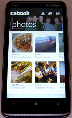
 Facebook 2.3 for Windows Phone appeared earlier today and looks great. It seems to run faster, has a cleaner look and feel, and a very nice Metro UI design that moves the user from an overview page to news feed to notifications to photos use the familar (to Windows Phone users) sidewards sliding gestures. The optional background images look good too. I initially considered not turning it on. However, I found it really adds a personal touch and will leave it on now that I’ve seen it. I wonder, though, if there is away to choose which images appear in the top banner.
The irony is that while it is nice to see a big update for the Facebook app, it is almost unnecessary on Windows Phone since 90% (or in my case nearly 99%) of Facebook activity can be handled from the Me hub (posts and notifications) and People hub (status updates).
(more…)

