Category: Smartphone

Windows Mobile Smartphone

  • The Problem with Video Podcasts on a Windows Mobile Device

    Video, unless specially prepared, is often an unsettling experience on a Windows Mobile device. Although I’ve been using Ilium Software’s NewsBreak since its 1.0 release, I only recently tried the podcast retrieval feature added (I think) with their 2.0 release. I decided to try the Geekbrief.tv video podcast since it was included in Ilium’s default list. The video podcast looked like an old stop-motion movie when viewed on an HTC Vox smartphone. So, I decided to try it on a Dell Axim X50v. Although this is an older device, it still has a fast CPU and video accelerator. Video motion on this was much smoother than on the Vox with its relatively slow CPU. However, the video and audio were out of sync.

    Although I haven’t tried to view this specific video podcast on an iPod video, I do subscribe to other video podcasts on the iPod and do not see any video or video/audio-sync issues on that device.

  • WiMo Smartphone 2 and 8 Keys Browser Navigation

    Scrolling through a long web page on a Windows Mobile smarpthone (Standard Edition) can be a giant pain using the up or down arrows on a navigation pad. However, you can (sometimes) use the 2 and 8 keys to page up and down (respectively) through a web page in Internet Explorer. And, yes, it works on smartphones like the Dash with QWERTY thumb keyboards instead of a conventional numeric keypad.
    Note that the 4 and 6 keys do not scroll left/right as they do when using Operamini. And, it doesn’t do anything on a Pocket PC (Professional Edition) – presumably because you can use a stylus to quickly move through a page. And, this keyboard trick doesn’t work on all pages. The infamously mobile device unfriendly CNN.com website inexplicably grabs the keys to use with their little used bottom of page menu section (this doesn’t happen with a desktop PC, btw).

  • The Multipurpose End Call Button

    You definitely know that pressing the End Call button on a Windows Mobile (Standard Edition) Smartphone ends a call 🙂 And, you probably know that pressing and holding the End Call button locks the keyboard (left soft-button and then * unlocks it). But, did you know that a simple press (and then release) of the button when you are not in a phone call moves you from whatever menu or app screen you are currently on back to the Today screen? This works on Pocket PCs with a End Call button too, btw. You can get back to the previous window (if you pressed End Call by accident) by pressing the Back (left arrow) button (this doesn’t work on a Pocket PC Phone Edition, btw).

    The End Call button is often bigger and easier to find than the Home button. So, this can be a quicker way to get back to the Today screen to, for example, make a phone call or quickly check for an upcoming appointment.

  • Tried Opera Mini 4 Beta 2 on a T-Mobile Dash Smartphone

    After being impressed by Open Mini 4 Beta 2 on a HTC Vox smartphone, I decided to try it on another Windows Mobile 6 smartphone: The T-Mobile Dash (HTC S620). The Vox has both a QWERTY thumb keyboard (pull out) as well as a standard numeric dialer layout. The Dash, on the other hand, just has a QWERTY thumb keyboard (my favorite of the various thumb keyboards I’ve tried). Opera Mini seems to place the keyboard in numeric keypad mode when in browse mode because I was able to use the 2-4-6-8 diamond pattern embedded in the QWERTY keyboard layout to quickly navigate around a web page. The Dash has a very reasonable square layout for the numeric keypad on its keyboard. The Vox, on the other hand, has a slightly asymmetrical keyboard layout that makes navigation a bit harder.

    CNN.com was still unreachable (although alive from any other device I tried). But, other sites I tested looked and worked fine with Opera Mini.

  • Opera Mini 4 Beta 2

    Opera Mini 4 Beta 2

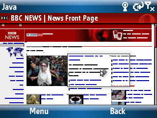
    I have to admit that with the release of Opera Mini 4 Beta 2 last week, this browser is growing on me. The image above is the BBC News’ main web page in Opera Mini’s full page thumbnail view. I’m testing it on a HTC Vox (Windows Mobile 6 smarthone), btw. If you look carefully, you can see a small rectangle with a cursor arrow. Pressing the select button zooms in to that area. Then, it is easy to use the 2 4 6 8 (up, left, right, down) keys to navigate around the page without going back to the thumbnail view. The zooming and scrolling is lightning fast and makes for a good browser experience on a small smartphone screen.

    There are a couple of interesting issues, however.

    First, there appears to be at least one major web page that just doesn’t like the browser. In this case it is CNN. I tend to use the cnn.com web page for browser testing because it is one of the most mobile-unfriendly major websites I know of. In the case of Opera, it just times out. And, no the site was not down when I tried to access it.

    Second, if a site is too mobile friendly (I know this seems like an odd idea), it defeats the great Opera Mini thumbnail and quick navigation features by defaulting to the mobile friendly site which tends to less rich than the full site intended for viewing on a desktop. I tested it with msnbc.com which detects your platform and sends you to a mobile friendly version of the site if it detects you are using a mobile device.

    Third, and this is kind of ironic, Opera Mini works better (from a keyboard navigation point of view) on a simple numeric dialpad layout than it does with a full QWERTY thumb keyboard. I found myself sliding the Vox’s keyboard back under the device and switched to the simpler numeric dialpad to speed up navigating around Opera’s screen. I haven’t tested it with the Dash which only has a QWERTY keyboard. I suspect it will not be as nice as using Opera Mini with a device like the Vox which gives you a choice. Another irony? The problem is that I prefer the Dash’s QWERTY keyboard to the Vox’s QWERTY keyboard.

    Finally, the odd (probably related to the Java platform) procedures for functions like typing a web site’s URL and accepting (many more keystrokes than with Internet Explorer) is kind of annoying.

    That said, I like what I see in Beta 2 and am looking forward to what comes next from Opera for smartphones.

  • Finding Free Windows Mobile Software in the Windows Marketplace

    I think I’ve mentioned this before, but here is a bit more detail about looking for free Windows Mobile software available in the Microsoft Windows Marketplace site. Here are two sample links…

    Free Pocket PC  Software in Windows Marketplace

    Free Smartphone Sofware in Windows Marketplace

    If you take a look at the way the URLs for each one is constructed, you can figure out how to search for other free software using different keywords. Just replace the search string after the text= part of the URL string. I don’t include a link to search for the words Windows Mobile. But you can figure that out by looking at the URL in your browser’s address bar.