Category: Back to Basics

Simple but important information

  • Back to Basics: Assigning Apps to Buttons

    App Key 1

    The blog item I wrote earlier about Google’s tip for assigning Google mobile applications to a Samsung Blackjack’s key pointed out that not all Windows Mobile Smartphone (AKA Standard Edition) devices have this feature. However, all Pocket PC type devices (Professional Edition, Classic Edition) have this feature baked in by Microsoft. The problem is that because there is so much variation between Pocket PC type devices, key assignments can vary in physical position of the device. And, it may not be obvious to you which key is being referred to.

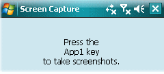
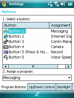
    For example Ilium’s great freeware Screen Capture application (what I use for every WiMo screen capture you see in this blog) tells you that its snapshot key is assigned to the App1 key. For the last couple of generations, the App1 key has been the Messaging button (the one with the envelope icon on it). However, if you want to be sure, you can go to Settings and select the Buttons option to see which button is assigned to which application. From here, you can change the assignment of applications to buttons as well as the navigation pad.

    The Media Player can assign individual functions to buttons and the navigation pad. However, this doesn’t always work as expected. The venerable Dell Axim X51, for example, would simply not allow any Media Player functions to be assigned to the four main buttons beneath its LCD screen. This made it very difficult to use Media Player without looking at the screen and using a stylus. Despite my otherwise high opinion of the Axim X51 (I think it is the best Pocket PC since the great HP Jornada 560 series), this problem along with the loss of ability to create playlists starting with WiMo 5, convinced me that I should buy an iPod an give up using WiMo devices as multimedia playback devices (they still are great for still photos and mini video clips though).
    Windows Mobile Pocket PC Settings Buttons

  • Back to Basics: Soft Reset

    Have you ever found your Windows Mobile smartphone (Standard or Professional Editions) in a state best described as frozen? This can happen in several ways. The most common experience on a non-touch Standard Edition device is that it becomes so slow that I can’t seem to get any action to work on it. Can’t dial, can’t launch an application, can’t even navigate. Recently, my HTC Advantage touch screen device (Professional Edition) has refused to turn on once in a while (perhaps 3 to 4 times in the past month).

    Personally, many of my apparent freeze ups are usually related to some kind of Internet Explorer related memory management problem. The usual problem is that the cache gets large and slows the entire device down. A little patience while slowly navigating to the IE option to clear the cache usually resolves the problem. However, when my Standard Edition seems completely frozen to the point where the on/off button does not work, I usually end up pulling the battery out, put it back in, and turn on the phone. I’ve never had a problem with this procedure. But, your mileage may vary. So, proceed with caution.

    Pulling the battery out and putting it back in amounts to a kind of hardware soft reset. The difference between a soft reset and a hard reset is that a hard reset puts your device back in the state it was at the factory. Data, configuration information, and applications added after you received it will disappear. A soft reset restarts the system but leaves data, configuration, and software alone.

    Pocket PC/Professional Edition touch-screen devices have a recessed dedicated soft-reset button somewhere on its chassis. The location differs from model to model. The button is usually very small and fit to the point of the stylus that came with the device. Ballpoint pen and other larger tips will not work. Pressing the reset on the HTC Advantage has brought it back to life each time. But, I’m not a huge fan of using this button. The reset on my old Compaq iPAQ 3650 actually wore out because I had to use it so much on that box. There are free soft-reset software utilities available. But, these don’t help if your unit is completely unresponsive.

  • Back to Basics: Unfocused Smartphone Browser Text Boxes

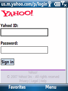
    Yahoo! mobile login screen

    Pocket PC (Classic/Professional Edition) users probably don’t notice any browser text box focus issue because they simply tap text boxes with their stylus and force it into focus. Smartphone (Standard Edition) users, on the other hand, probably have run into the following issue: Browse a web page with a text box entry (say a login screen). Focus on a text box (or so you think) and then start typing out a username or password. All of you sudden you notice that the first letter is not in the text box although subsequent characters are. What happened?

    It turns out that focusing on (navigating to) a text box is not sufficient. You need to press your Select button to actually bring the text box into full focus. Actually, tapping on any key does this but the key itself (if it is a printable character) does not show up. That is why the first character frequently is missing in these text boxes.

    So, the simple behavior to adopt is to tap the select button once you navigate to a browser text box before typing in any text.

  • Word Mobile vs. Word Mobile

    Smartphone Word vs. Pocket PC Word

    I should actually place this blog item in a category named something like Preparing for Back to Basics.

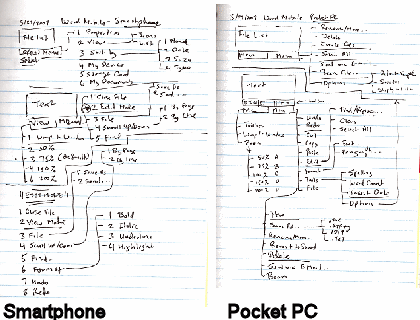
    Word Mobile didn’t exist for the Smartphone (AKA Standard Edition) until Windows Mobile 6 devices rolled out earlier this year. For some reason I expected to it be the same as or very similar to Word Mobile for Pocket PC (AKA Classic and Professional Editions). One of the first things I did after getting my hands on both types of Windows Mobile 6 devices was to compare the menu structures for Word Mobile on the both editions. Although it may look like the Smartphone (Standard Edition, non-touch screen) Word Mobile has as many features as the Pocket PC Word Mobile from the diagrams above, they really do not even appear to share the same codebase let alone functionality. The reason the Smartphone Word Mobile menu has so many option branches is because of its modal nature. That is to say that Word Mobile on the Smartphone resembles vi from UNIX/Linux that it does Microsoft Word. So, there are two distinct mode branches that simply creates menu complexity rather than provide features. Word Mobile on the Pocket PC, on the other hand, has a much richer feature set and its branches represent unique functions rather than modal branching.

  • Back to Basics: Touch Screen Alignment

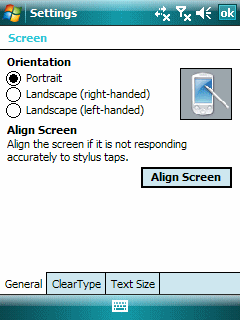
    Pocket PC Align Screen

    I had two recent touch screen issues that prompted me to write a bit about screen alignment.

    The first has to do with the iPod touch. My daughter brought her touch to me and said touching the left side of the screen did not work. After fussing with it for a bit, I peeled off the $14.95 screen protector she bought recently from the local Apple Store. And, yep, the touch screen worked fine. I had to try twice before reseating the screen protector to the point where touching the left side of the screen worked. To make matters worse, this $14.95 screen (ouch!) is not even clear. It is translucent. I don’t like it at all. On the other hand, the $3 screen protector I bought from iFrogz is transparent and does not see to cause any touch screen issues. It is thinner than the one from the Apple store. This makes it harder to place it on the screen without bubbles.

    The second screen issue cropped up with the TyTn (1st model). I found I couldn’t grab the scroll bar on the right side of the screen the other day. After fussing around with this device a bit and aligning the screen a few times, it occurred to me that I was one of the old styuses I had bought in the 1990s. It turned out that the tip was just a little to wide. The Pocket PC (Professional Edition) is a touch screen but not a fat finger or even a fat stylus tip touch screen.

    Touch screens used to be even finickier in the old days than they are now, believe it or not. We used to have lots of problems with dust going under the screen and even a small bug or two taking up residence under the first screen layer. So, perhaps a few alignment issues now and then is not so bad.

  • Back to Basics: Is Turning ClearType On Actually Useful?

    Windows Mobile ClearType

    It was, I believe, at the 1997 Fall Comdex that I first saw Bill Gates announce ClearType technology for notebook LCD displays. The ClearType anti-aliasing technique’s purpose was to render easier to read text on LCD displays. I looked down at my HP 320LX and wondered if we would ever see this technology trickle down to the Windows CE Handheld PC (which had just emerged at the previous 1996 Fall Comdex). It took a few years, but we eventually saw it become available for the Pocket PC (but not the Smartphone). After it became available, I regularly turned it on for each new Pocket PC. After a while (a year or two perhaps), it began to dawn on me that text on the Pocket PC screen might actually be easier for me to read with ClearType turned off.

    I’ve tried toggling the ClearType setting on a number of Pocket PCs over the years. And, in general, I’ve been leaving the option unchecked (turned off). My non-expert guess is that as I became older and Presbyopia (a reasonably normal part of aging) set in, a kind of natural anti-aliasing was created by my visual system. So, turning on ClearType just resulted in fuzzy looking font that was harder to read than a font with aliasing.

    This probably varies greatly from person to person. So, you might want to test using your Pocket PC with ClearType turned off and on a couple of times to figure out which setting looks best to your eyes.