Visiting mobile.espn.com on an iPhone redirects you to an iPhone specific site. The mobile web design world is definitely iPhone-centric these days.
Category: Apple
-
Evernote for iPhone Update to Version 1.2

Evernote updated their iPhone client to version 1.2 and added the ability to edit notes. I ran into this error (see image above) after downloading the update using iTunes though. And, I was not able to update it at all directly from my iPod touch. However, after disconnecting the USB cable, it looked like the application actually installed on my touch. Firing it up I found that the new client can only update notes that are purely text. Even a file that included hyperlinked text with no other formatting was not editable. -
Google Translate for iPhone

I wonder how much of Google’s iPhone focused web-apps will work directly on Android based phones? In any case, Google Translate for iPhone looks great in my quick tests (with my limited knowledge of anything beyond English, and some would say, even there…). Just head over to……on your iPhone or iPod touch. It redirects you to google.com/m/translate. The first URL results in the desktop page if you try it on a Windows Mobile smartphone. The second, direct, URL just throws a WiMo smartphone to Google’s simplified mobile home page. Once again, Windows Mobile gets no web-love. Sigh. Glad I bought an iPod touch to see the cool stuff Windows Mobile users are missing out on.
You can read the announcement for this new iPhone web service on Google’s blog at…
-
Watch NBCOlympics.com Video Clips on Your Phone (iPhone too!)

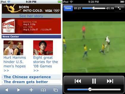
Everyone probably knows about the Microsoft Silverlight-powered NBCOlympics.com site. But, did you know you can access its information AND videos on your smartphone too? Yep, head over to…I tested video playback on my iPod touch and found that it works fine. So, iPhone users will not be left out of the Olympics this summer.
-
WordPress for iPhone Changed the Way I Blog

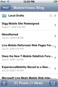
It isn’t often that a mobile software tool completely changes the workflow of something I’ve done for a long time or changes the way I think about performing a desktop task. But, the free WordPress for iPhone app has managed change the way I create blog items and the way I think about my blogging workflow.My typical workflow for writing about smartphone software or web services used to work like this: I would write a note about the topic using something like Word Mobile or Word Excel on my Window Mobile smartphone. Then, I would use Ilium Software’s free (and still awesome) Screen Capture utility to capture a screen. Then, I would either email the BMP image file (not a good idea because BMP files are relatively large and I am on a relatively slow EDGE network) or wait until I get back to my desktop and copy the files from the smartphone to the PC using ActiveSync. Then, I’d convert the BMP file to a GIF or JPG file to reduce the file size, upload it to this blog, and finally start writing the blog entry.
WordPress for iPhone on my iPod touch has simplified this Rube Goldberg-like process to this: Capture a screen on the iPod touch, write a blog entry using WordPress for iPhone, attach the screen shot, post it to my blog.
Sometimes, there is another step or two added to this. For example, this blog entry and the one that preceded it both started on my iPod touch. However, I saved the starter blog entry and the screen shot as a draft instead of publishing right away. Then, I moved to a desktop computer and finished writing the blog there since it is easier to type with a full keyboard.
This has really made blogging here much simpler and faster. And, it is probably why you may have noticed that I post more items about the iPhone/iPod touch here than I did in the past. Now, if only there were a WordPress for Windows Mobile, I would be a lot happier since typing on a Windows Mobile physical thumb keyboard is still a lot easier and faster than typing on the iPod touch’s on-screen virtual keyboard.
-
Back to Basics: The Mobile Browsing Experience

Most web pages are designed to be viewed on a desktop or notebook computer. Looking at these pages on a small screen phone is like looking at a mountain range through a pinhole. It is not a good viewing experience. Some web site owners and designers now understand that many people look at their pages on-the-go on their phones and other small screen mobile devices. Unfortunately, there are tremendous differences between the various browsers on various devices.My first web-enabled phone had a monochrome display that placed black characters on a green-ish tinted background like the green-screen CRTs from decades ago. It supported the Wireless Access Protocol (WAP) which simply placed characters on the tiny screen and assumed your main input was a 12-key phone keypad. These days it is still considered the most basic format supported and you still see addresses like wap.ao.yahoo.com. It has the advantage of being lightning fast because it is usually text with little formatting. It also works on almost every mobile device running today.
Many of today’s so-called smartphones use mobile versions of familiar desktop browsers such as Internet Explorer and Opera. These smartphone browsers often are missing some of the functions of their desktop counterparts but can deliver a limited but still useful web experience if a website is designed for the mobile browsers limitations.
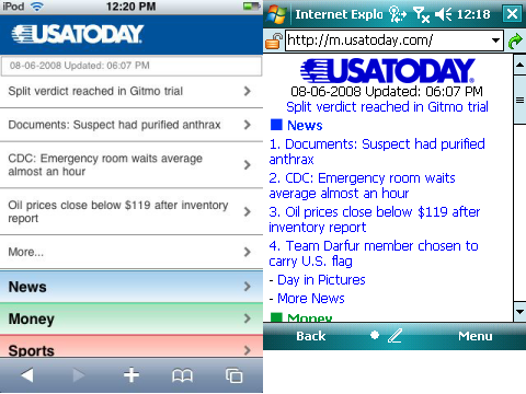
Finally, there are mobile browsers that deliver near desktop experience on a small screen. Opera Mobile and the Apple iPhone’s Safari deliver outstanding mobile web browsing experiences. However, as good as these browser are, the pinhole viewing effect still exists. Fortunately, some websites are now designed to identify the different mobile browser types and deliver optimized web pages for the different platforms. The USA Today newspaper online site is a good example. If you type usatoday.com in an iPhone (or iPod touch) Safari browser, it automatically redirects you to the iphone.usatoday.com site optimized to look and work best with an iPhone. Typing the same usatoday.com on a Windows Mobile smartphone, on the other hand, sends you to the simpler but still useful m.usatoday.com formatted for use with most of the web browsers used by smartphones using various mobile operating systems.
You can see two versions of the same USA Today web home page above. The screen on the left is the page formatted for an iPhone. The screen on the right is formatted for most mobile web browsers. This specific screen capture came from a Windows Mobile Professional Edition smartphone with a touch screen.
Incidentally, the one thing you rarely see is the ill-fated attempt to create mobile specific web domains ending in the .mobi name suffix. The common naming conventions for mobile friendly websites use prefixes such as wap. (wap.oa.yahoo.com), mobile. (mobile.msn.com), and m. (m.digg.com). Sites designed specifically for the iPhone sometimes use the prefix iphone. (iphone.usatoday.com). There are other variants such as a trailing /i path after the domain name (friendfeed.com/i). So, it can be a challenge to figure out what the correct mobile friendly webpage name is if the site does not auto-identify and redirect you to the correctly formatted site as USA Today does.
The good news though is that browsing from your phone or other small screen devices is on the radar of web site ownes and developers. And, it has resulted in a much improved web browsing experience when on the go.
