Everyone seems to think the recent Google+ 2.0.0 for iPhone update is the best thing since the sliced bread. I, however, have a very different opinion of the updated app: It is terrible in general and provides an especially awful experience on an iPad.
(more…)
Category: Apple
-
A dissenting opinion: Google+ 2.0 for iPhone is awful
-
LinkedIn app upgrade adds iPad support
I’m not a big LinkedIn user. However, if you are and have an iPad, the LinkedIn for iOS 5.0.0 update is just the thing for you. In addition to working with the iPad’s larger display, the update also provides a New calendar feature lets you see LinkedIn profile information for people you’re meeting with.
You can learn more about the updated app in this LinkedIn blog entry.
-
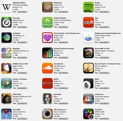
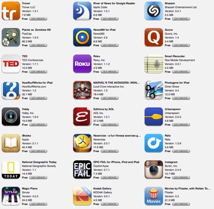
Apps updated for my iPhone or iPad in the past week: 51
Fifty-one (51) apps were updated for my iPhone or iPad in the past week. Here’s a summary of the updates that I found interesting.
(more…) -
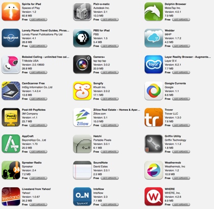
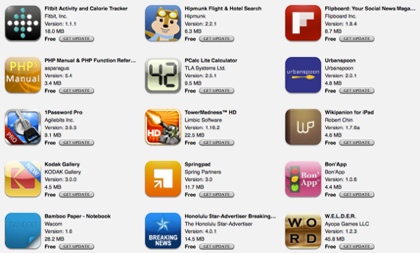
Apps update for my iPhone or iPad in the past week: 39
Thirty-nine (39) apps were updated for my iPhone or iPad in the past week. Here’s information about some of the more interesting updated apps.
(more…) -
iPad display polarization disappearing display problem nothing new (video from June 2010)
I was surprised to see this “news” item appear in ZDNet a few days ago: iPads go black in portrait mode with polarized sunglasses. This problem has existed since the first iPad launched in 2010. You can see a video demo of the problem that I posted back on June 5, 2010. What is surprising, however, is that Apple never fixed the problem in the next two iPad generations.
-
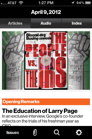
Bloomberg Businessweek+ for iOS adds iPhone compatibility
The Bloomberg Businessweek+ app, which just passed the 100,000 subscriber mark among iPad users, officially launches for the iPhone and iPod touch tomorrow (April 11, 2012).
The app breaks the magazine replica format used by most e-magazines by providing a web-like navigation experience on the iPhone. The tabbed categories seen in the iPad version of the app is not available on the smaller iPhone display. However, the navigation system brought over from the iPad makes it fast and easy to select an article within a topic category. The content of a single article is viewed vertically. Moving to another article within a topic category is down by swiping left or right. This eliminates the need to go back up a hierarchical tree to find another article in the same category. I prefer this break away from the paper magazine replica approach. It provides faster navigation and a better reading experience.
The developers managed to keep the content download time way under typical magazine downloads I’ve experienced. They claim that an issue can be downloaded in about three minutes over a typical 3G connection. I downloaded an issue over WiFi and found it ready to read in about a minute.