Category Archives: iPod

Apple iPod products

Apple Web Apps List for iPhone and touch

Apple.com WebApps

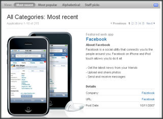
No third party binary applications for the Apple iPhone or iPod touch yet. However, Apple created a list of web apps for these devices. You can find it linked below.

Apple Web Apps

I was surprised to see so many (relatively speaking) web apps designed specifically for the iPhone/touch (215 as of Oct. 11, 2007). It will be interesting to see if this part of the iPod eco-system continues to grow.

Stylus vs. Finger

The old Windows CE Handheld PCs had large (by today’s thumb keyboard standards) physical keyboards and a touch screen. They never caught on (even though I really enjoyed using them :-). The problem was that the touch screen were really just a substitute for a mouse and the need to pick up a stylus in between typing was annoying.

Following the lead of the Palm Pilot, Microsoft moved on to the Palm-size/Pocket PC and dropped the physical keyboard completely. Then RIMM’s Blackberry and Palm’s Treo showed that a physical keyboard was indeed a good thing but needed to be sized and designed correctly. Many current generation Windows Mobile Pocket PCs (Professional Edition) and Smartphones (Standard Edition) have physical thumb keyboards too. And, many of them are well designed (I particularly like the Dash’s and TyTyn’s).

Recently, Apple went retro and introduced the iPhone and iPod touch with touch screens that don’t need (or work) with a stylus and dropped the physical keyboard in favor of a graphical tactile-less one. On one hand, the finger gestures for viewing photos and navigating web pages works much better than stylus based Pocket PCs or keyboard based Smartphones. On the other hand, I guess I’m just one of those fumble-fingered people who prefers tactile feedback when typing (even thumb typing). I do think it is great that I don’t have to reach for a stylus to use the iPod touch. But, I really wish I had some kind of option (Bluetooth keyboard for example) for the iPod touch.

I was originally going to comment on the relative granularity differences between finger touch screens and stylus touch screens. But, I need to think that through a bit more. It just occurred to me that one of the original applications categories for the Pocket PC were little mini-PhotoShop type drawing apps. Yet, those never did become very popular. And, we don’t see that category heavily pushed or sold these days. Part of the issue may be the relatively small processing power on mobile devices (compared to desktops). But, I wonder if the digitization errors inherent in any touch screen might have something to do with this too. More later…

Senuti 0.50 Beta 2: Copy Media Files from an iPod to a Mac

Just an quick blog item this evening. I posted an item over on my Freeware and Free & Open Source Software blog (OgasaWalrus) about a Mac OS X freeware that lets you copy media files from an iPod to a Mac.

Senuti 0.50 Beta 2: Copy Media Files from an iPod to a Mac

In my case, this is a backup plan in case I can’t restore the backup of my now dead Mac mini (the backup is on an external Firewire drive) to whatever replaces my Mac mini.

Zune vs. iPod Language Handling Differences

iPod touch and Microsoft Zune

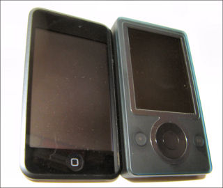
An odd confluence of events took place over the past few days. First, my Mac mini died suddenly and without warning last week (which left me Mac media-less since I don’t keep media on my Macbook). My iPod touch arrived on Monday. Then, Microsoft announced the new Zunes yesterday. My 1st generation Zune doesn’t have the 2.0 update yet. But, it got me thinking about the Zune again. So, I decided to put music from the same CD on both devices to see if my non-golden ears could hear any difference. I used a CD that my daughter and I have been listening to lately… Utada Hikaru’s Single Collection, Vol I (an import).

However, before I could get to the audio comparison I ran into some interesting differences in the way the Zune desktop software and iTunes dealt with the disc’s contents. Apple’s iTunes brought in the CD exactly as shown on the jacket. Title parts that were in English (roman letters) remained in English. Title characters in Katakana (phonetic Japanese characters) stayed that way. The Zune software, on the other hand, decided to, um, transliterate from Katakana characters to roman alphabet. The Zune software couldn’t figure out one of the titles at all though. So, it is listed as “[Untranslated]”.
The other difference that amused me was how the Zune software and iTunes decided to deal with the artist’s name. iTunes left it Japanese characters and sorted it out of range (after “Z”). The Zune decided to transliterate it to “Hikaru Utada”. And, this confused me when I tried to search alphabetically by artist. You see it reversed the expected Surname/Given-Name order (Utada Hikaru) to the western Given-Name/Surname order (Hikaru Utada). So, I was doubly confused. It was not listed in the “U” section or out of range (after Z).

It will be interesting to see what the Zune 2.0 firmware update and, presumably, new Zune desktop software does when it becomes available.

iPod touch and T-Mobile Dash – Tactile Impressions

iPod touch and T-Mobile Dash

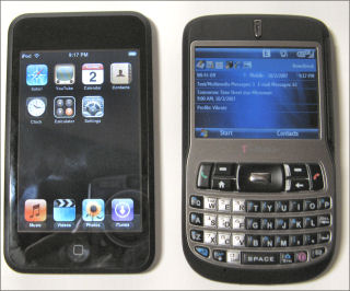
My 16GB iPod touch arrived yesterday. Since I’m probably among the last of the mobile enthusiasts who got a touch (even though I pre-ordered it the day it was announced), I’m not even going try to write a mini-review. However, as a Windows Mobile enthusiast, I thought other Windows Mobile users might find a couple of quick observations from that point of view interesting.

The T-Mobile Dash (Windows Mobile 6 Standard Edition, formerly Smartphone) has been my main device for the past half-year or so. As you can see from the photo the iPod touch and the Dash are pretty close in height and width dimensions although the touch is much thinner than the Dash (0.31 vs. 0.5 inches). According the to iPod touch spec page and the T-Mobile Dash spec page, both are 4.2 ounces. Frankly, I’m having a hard time believing this. The touch feels much much heavier than the Dash. But, I don’t have a scale to check this, so I’ll believe the specs. You can see that the screen is about twice the physical size of the Dash’s screen and is exactly twice the resolution (480×320 vs. 320×240).

The one thing that became obvious real fast is that thumb typing as I know it is impossible for me on the touch. The lack of tactile feedback and what appears to be a slight digitizing offset (selection appears slightly to the left of where I touch the screen) is deadly. My typing mode (especially for passwords) is reduced from two thumbs to my right hand index finger. I’m really tempted to use a stylus when I need to type on the touch. The Dash’s keyboard, on the other hand, is the best thumb keyboard I’ve used on a Smartphone (the Universal’s and TyTn’s keyboard are my favorites on the Pocket PC side of the Windows Mobile house).

One somewhat surprising aspect of the touch’s lack of tactile feedback is that I don’t think I can use it without looking at the screen. I’ve also used the iPod nano and the 5th generation iPod (video). Both of those are very easy to use without looking at the device because the click wheel gives lots of location and tactile information.

IMHO Apple was wise in NOT positioning the iPod touch as a PDA. It is clearly not a PDA. On the other hand, its Safari browser is clearly superior to Windows Mobile’s Internet Explorer (and Opera mini on Windows Mobile — for me anyway). That combined with a relatively easy (but not great) YouTube app makes the iPod touch the current overall multimedia champ. I just looked at the new Zune announcements. I think the Zune still has a lot of catching up to do. But, more on that after the firmware upgrade for the current generation Zune’s become available next month. I’ll flash my Zune then and give it a spin.
Thumbing Around an iPod touch Screen Keyboard

My iPod touch is still wandering around in FedEx-land. But, I was able to use my daughter’s iPod touch for a few minutes to help her set up WiFi access. I found it nearly impossible to type on the screen keyboard in portrait mode. The lack of tactile feedback from a physical keyboard is a real drawback. However, using the screen keyboard in landscape mode was a bit better though I still pressed the wrong key way too many times. I think the 2.0 versions of the iPhone and touch really needs a slideout keyboard even though it would increase the thickness of each device. I’ll get a better feel for this after I have some time to play with my own device (which should arrive soon).