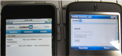
Linkedin is the latest big social network site to mobile enable itself. You can find the mobile friendly site at…
It would have been nice if they adopted the “m.” prefix to reduce the amount of tapping on a small keyboard or screen. But, oh well…
The real story here though is that once again the barebones display designed for WAP-ish devices like Windows Mobile that can’t deal with a rich web site design looks horrible compared to the much richer iPhone/iPod touch version. You can probably figure out which is which in the photo above. One is an iPod touch. The other is a T-Mobile Dash Windows Mobile 6 smartphone (amateur edition).