Windows Mobile 6 for Samsung BlackJack came in on Wired’s Vaporware 2007 list at #6. Wired writes: A buggy black-market upgrade for AT&T BlackJacks surfaced this summer, but it’s a far cry from the real deal. Meanwhile, owners of the original BlackJack are stuck in version-5 limbo after seeing their WM6 dreams go up in vapor. Sorry Blackjack owners. Welcome to the uneasy and unpredictable world of Windows Mobile upgrade roulette.
Year: 2007
-
YouTube Demo: Windows Mobile Live Search vs. Google Maps for Windows Mobile Zoom Feature
Microsoft announced an updated version of Live Search for Windows Mobile…
Live Search for Mobile Updated
So, I decided to compare its new Zoom feature to Google Maps for Windows Mobile. You can see the somewhat blurry (sorry about that) but informative (I hope) video on YouTube at..
Windows Mobile Live Search vs. Google Maps for Windows Mobile Zoom FeatureCan you guess which one has a better map zoom interface? Watch the video and find out. It is just 2 minutes and 43 seconds long.
FYI: You can download the new Live Search for Windows Mobile directly on your Windows Mobile device by pointing it at: m.live.com
-
Word Mobile vs. Word Mobile

I should actually place this blog item in a category named something like Preparing for Back to Basics.
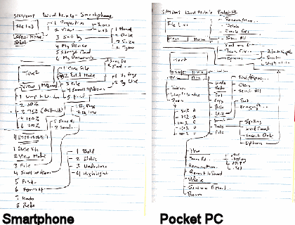
Word Mobile didn’t exist for the Smartphone (AKA Standard Edition) until Windows Mobile 6 devices rolled out earlier this year. For some reason I expected to it be the same as or very similar to Word Mobile for Pocket PC (AKA Classic and Professional Editions). One of the first things I did after getting my hands on both types of Windows Mobile 6 devices was to compare the menu structures for Word Mobile on the both editions. Although it may look like the Smartphone (Standard Edition, non-touch screen) Word Mobile has as many features as the Pocket PC Word Mobile from the diagrams above, they really do not even appear to share the same codebase let alone functionality. The reason the Smartphone Word Mobile menu has so many option branches is because of its modal nature. That is to say that Word Mobile on the Smartphone resembles vi from UNIX/Linux that it does Microsoft Word. So, there are two distinct mode branches that simply creates menu complexity rather than provide features. Word Mobile on the Pocket PC, on the other hand, has a much richer feature set and its branches represent unique functions rather than modal branching.
-
Official Google Mobile Blog
In case you haven’t already visited the…
…you might to add it to your feedreader or visit it a couple of times a month. One of the recent announcements is an over the air sync between Google Calendar and Blackberry devices. I wish they would provide that feature for Windows Mobile devices. There’s also an announcement about a new iPhone interface to work with Picasa.
FYI and BTW, this Google Mobile Blog is different from the…Google Android Developers Blog
…which focuses on Google’s own upcoming mobile phone.
-
ClearType Color Artifacts

The other day I wondered about whether turning on ClearType on Pocket PCs (Professional and Classic Editions) helped or hindered those of us with aging eyes. Here’s another ClearType issue that I noticed a couple of years. Under certain circumstances color artifacts show up. In the case illustrated above, I was reading an MSNBC news article on my Pocket PC with ClearType turned on. You can probably see the read dish glow around some characters that is especially noticeable with the letters “i” and “l” and, to a lesser extent, with “o”, “p”, “r”, “s”, “v”, and “s”. This artifact does not occur with ClearType turned off on the same device.
So, if the text on your screen looks a bit odd now and then, don’t reset your Pocket PC or change the brightness. Instead, try turning off ClearType and then check if the issue goes away.
-
Back to Basics: Touch Screen Alignment

I had two recent touch screen issues that prompted me to write a bit about screen alignment.
The first has to do with the iPod touch. My daughter brought her touch to me and said touching the left side of the screen did not work. After fussing with it for a bit, I peeled off the $14.95 screen protector she bought recently from the local Apple Store. And, yep, the touch screen worked fine. I had to try twice before reseating the screen protector to the point where touching the left side of the screen worked. To make matters worse, this $14.95 screen (ouch!) is not even clear. It is translucent. I don’t like it at all. On the other hand, the $3 screen protector I bought from iFrogz is transparent and does not see to cause any touch screen issues. It is thinner than the one from the Apple store. This makes it harder to place it on the screen without bubbles.
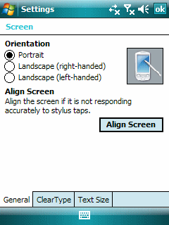
The second screen issue cropped up with the TyTn (1st model). I found I couldn’t grab the scroll bar on the right side of the screen the other day. After fussing around with this device a bit and aligning the screen a few times, it occurred to me that I was one of the old styuses I had bought in the 1990s. It turned out that the tip was just a little to wide. The Pocket PC (Professional Edition) is a touch screen but not a fat finger or even a fat stylus tip touch screen.
Touch screens used to be even finickier in the old days than they are now, believe it or not. We used to have lots of problems with dust going under the screen and even a small bug or two taking up residence under the first screen layer. So, perhaps a few alignment issues now and then is not so bad.