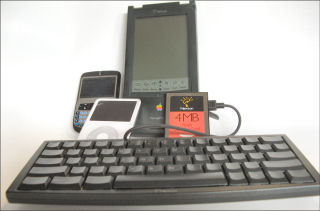
The Apple iPod touch is weeks away from delivery (early October at best). So, while waiting for it I decided to revisit the original Apple PDA. This is the Apple Newton MessagePad 130. I said in the video that is it 12 or 13 years old. However, according to Wikipedia, this model was released in March 1996. So, I probably bought it around then which makes it a bit over 11 years old. Although its rechargeable battery and backlight died long ago, the unit itself still works after all these years. So, click on the image above or this link here to view the short video to see the Newton in action. I’ll probably bring it back to show the Newton and iPod touch side-by-side in October.
Year: 2007
-
The Multipurpose End Call Button
You definitely know that pressing the End Call button on a Windows Mobile (Standard Edition) Smartphone ends a call 🙂 And, you probably know that pressing and holding the End Call button locks the keyboard (left soft-button and then * unlocks it). But, did you know that a simple press (and then release) of the button when you are not in a phone call moves you from whatever menu or app screen you are currently on back to the Today screen? This works on Pocket PCs with a End Call button too, btw. You can get back to the previous window (if you pressed End Call by accident) by pressing the Back (left arrow) button (this doesn’t work on a Pocket PC Phone Edition, btw).
The End Call button is often bigger and easier to find than the Home button. So, this can be a quicker way to get back to the Today screen to, for example, make a phone call or quickly check for an upcoming appointment.
-
BatteryUniversity.com Battery Info Site
I ran across this site a while back while looking at battery issues but don’t think I’ve mentioned it here yet…
I’m certainly no battery expert and can’t vouch for every detail of the site. But, the information there is quite detailed and accurate looking (to me). Well worth checking out IMHO.
-
Apple iPod touch
I’ve been saying since the introduction of the Apple iPhone that I just wanted the “i” part and didn’t need the “Phone” part of it. Today, with the introduction of the iPod touch, I got my wish.. or at least part of it.
Here’s what’s missing from the iPod touch when compared to the iPhone…- Phone radio (of course!)
- Bluetooth radio (aargh!)
- Camera (sigh…)
- Microphone and speakers (no VoIP either)
- Email client (for IMAP4 and POP3)
- Google Maps client
Still, what is left is pretty good. You can watch a video introduction on Apple’s site here (though the choice of spokes-person leaves me a bit baffled).
Apple iPod touch Guided Tour
I ordered mine this evening with shipment currently scheduled for late this month. So, you can expect to read iPod touch rants and/or raves sometime next month. -
Palm Foleo Linux Sub-notebook Bit the Dust
Wow, we didn’t even get a chance to see Palm get the Foleo out the door…
A Message to Palm Customers, Partners and Developers
I hope Austek gets the Eee PC out into the market. I still believe there is a significant market for a lightweight (2 pounds; 1 Kilo) category near instant-on device with a keyboard and LCD screen like the old Handheld PCs. The UMPCs are interesting. But their $1000+ price points for relatively weak specs (CPU, etc.) are not attractive. We need something in the sub-$500 range.
-
Tried Opera Mini 4 Beta 2 on a T-Mobile Dash Smartphone
After being impressed by Open Mini 4 Beta 2 on a HTC Vox smartphone, I decided to try it on another Windows Mobile 6 smartphone: The T-Mobile Dash (HTC S620). The Vox has both a QWERTY thumb keyboard (pull out) as well as a standard numeric dialer layout. The Dash, on the other hand, just has a QWERTY thumb keyboard (my favorite of the various thumb keyboards I’ve tried). Opera Mini seems to place the keyboard in numeric keypad mode when in browse mode because I was able to use the 2-4-6-8 diamond pattern embedded in the QWERTY keyboard layout to quickly navigate around a web page. The Dash has a very reasonable square layout for the numeric keypad on its keyboard. The Vox, on the other hand, has a slightly asymmetrical keyboard layout that makes navigation a bit harder.
CNN.com was still unreachable (although alive from any other device I tried). But, other sites I tested looked and worked fine with Opera Mini.
