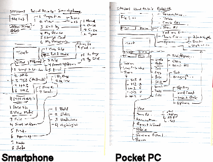
I should actually place this blog item in a category named something like Preparing for Back to Basics.
Word Mobile didn’t exist for the Smartphone (AKA Standard Edition) until Windows Mobile 6 devices rolled out earlier this year. For some reason I expected to it be the same as or very similar to Word Mobile for Pocket PC (AKA Classic and Professional Editions). One of the first things I did after getting my hands on both types of Windows Mobile 6 devices was to compare the menu structures for Word Mobile on the both editions. Although it may look like the Smartphone (Standard Edition, non-touch screen) Word Mobile has as many features as the Pocket PC Word Mobile from the diagrams above, they really do not even appear to share the same codebase let alone functionality. The reason the Smartphone Word Mobile menu has so many option branches is because of its modal nature. That is to say that Word Mobile on the Smartphone resembles vi from UNIX/Linux that it does Microsoft Word. So, there are two distinct mode branches that simply creates menu complexity rather than provide features. Word Mobile on the Pocket PC, on the other hand, has a much richer feature set and its branches represent unique functions rather than modal branching.